Week 4 has ended. The game now has an official name – DEFUNCT. Pretty cool.
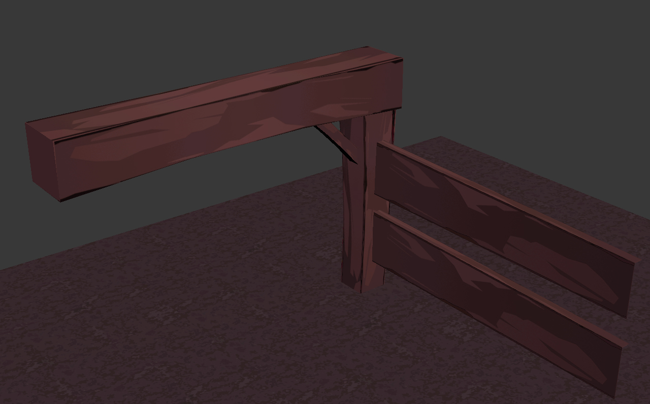
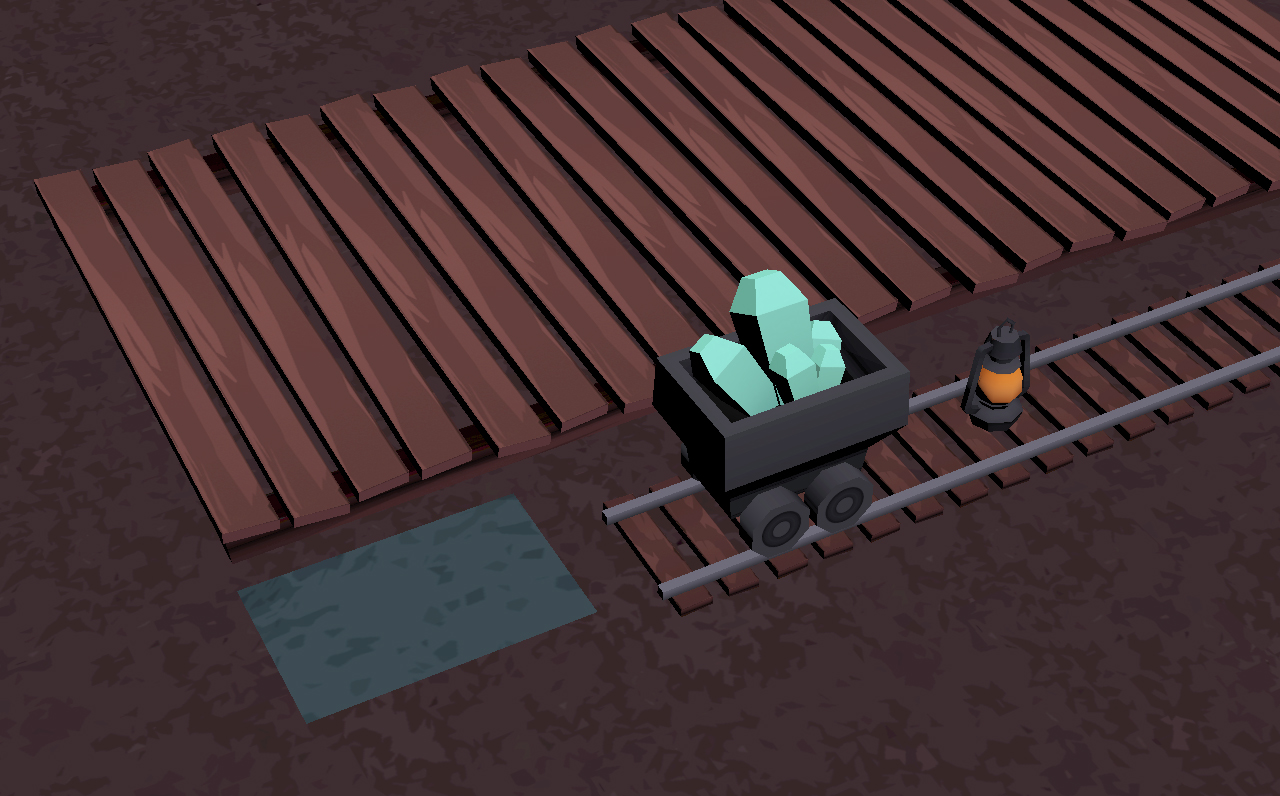
This week I finished the cave prop set, which I’m really happy with! Since these props will only be used in a specific area in the game, I really put thought into my color choices and how they all work together. I used a tetradic color scheme for the wood, metal, crystal and moss. (I made a mossy variant of the ground texture too)
Here’s a concept image I made to plan out the colors:


I also started working on a sky-sphere for the game. We want to have a dynamic sky with moving clouds and everything, so we’re using spheres instead of a skybox. We’ll have 1 or 2 transparent spheres with clouds inside the “real” sky-sphere that will rotate at different speeds, which hopefully will make for a really cool effect!
What’s left to do on the sky-sphere is to add the big waypoint for the player. The narrative of the game is based on you (the robot) falling out of the big spaceship you’re being transported in, and having to race your way back to it. The spaceship will be visible in the sky at all times, guiding the player towards not only their narrative goal, but also the end of the level.

I’ve also started designing the ship itself, which is pretty challenging! It needs to fit our art style, as well as make at least some sense in its design. It needs to look cool too, considering the player is going to see it a lot! It’s no accident that the back part looks like a wrench – in the original concept the robot was racing towards a big building with a wrench sign on it, to get fixed. We decided to bring that into this design as well. In a way, it still represents being “rescued”.

Here’s a quick concept sketch I made for the main menu. It shows the main character lying on the ground next to the box he fell down in, and the ship speeding off into the distance. I’m still not entirely satisfied with the composition, but this is just a rough sketch.
![]()
And lastly, here are some quick logo concepts. I really like the idea that the D is the head of a wrench. I guess what we need for the logo is something that’s cartoony, but not silly. It should reflect the seriousness of the character’s motivations, while still adhering to the art style. It’s going to be a fun challenge!
Next week, we’re going to nail the main character’s appearance (there are still some differing opinions about how “damaged” he should look”, and then produce the actual texture. I think we’re going to use a high-poly model to generate ambient occlusion and normal maps for the character, even though we’re not using normal maps for other things in the game. But we’ll see if there’s time for that. On Friday we need to have our alpha done, so we’ll be working hard this coming week!
